Logos drive decisions. That’s the main reason authors need logos.
Consider this. If you use a smartphone, how do you know which app to use? Without a logo, how would you make a choice? Would you recognize which station you are watching without a logo? Would you know which Roku channel to select without the logo?
“But I don’t plan on having an app related to my book. Why would I need a logo?”
Do you plan on marketing your book? (I’m worse that a 5–year old with all my questions, aren’t I?) However, there’s a reason for all these questions. I believe your answers determine whether a logo is important for branding your message.
A logo is a powerful marketing tool on multiple platforms.
So here are some additional questions.
- Will you market your book through a website?
- Do you have an email list? If not, after you build one, do you want instant recognition when you send emails to potential buyers?
- Will you use social media as a marketing platform?
- Are you considering a series of books or associated products?
- Will my lack of a logo say, “I’m not committed,” or “I’m nobody,” or even worse, “I’m not reputable.”
- Do I want to differentiate myself from ‘the competition?’
If your answer is yes to any of these questions, then you should have a logo.
What Makes a Good Logo?
A good logo considers:
- Message
- Personality
- Current Style Trends
- Uses/Places the Logo Will Appear
Let’s look as each one of these factors.
Your Message
As a self-published author, your book fits within a genre. In addition, especially if you are a non-fiction author, your work may fit with a specific topical arena. This is common for subject matter experts.
This is the stage at which you should consider whether you plan on a series of books on a topic. Or maybe your message is centered around inspirational topics.
Consider Deborah Segraves logo for her series of children’s books and poem collections.
![]()
The concept behind this logo was flowing water—including water flowing into the letters.
Personality
Your personality is an important component of an effective logo. You want to feel good about it. You should like it.
Current Style Trends
In 40 years, a logo from 10 years ago will be ‘retro’ with a few tweaks. Just look at all the retro trends around us. Yet, even though colors and styles are back from the past, they’ve taken on a modern feel. Thus, even a great logo from the past isn’t likely to appear just as it was.
Now if your logo was created 10 years ago, it may need an upgrade if you want to deliver the message you’re still relevant.
Uses/Places the Logo Will Appear
The logo needs on a book cover can be quite different from the logo requirements on a website. A business card isn’t the same as a brochure. The icon that identifies your website will be more effective if it’s simplified.
As you’re developing your logo, consider how easy it will be to adapt the logo to different functions. For example, the Living Waters Books & More logo isn’t as easy to adapt to use as an icon as my Writing My Own Book logo. However, by going back to the original source graphics for the background, I could create a square logo just for the website’s icon.
How all this applied to the logo for Writing My Own Book.
Initially, my logo had little identity. In fact, it inherited it’s style from a previous business because I wanted to maintain a sense of cohesiveness with my first business website, WritingAsAGhost.com. During the transition from Writing as a Ghost to Writing My Own Book, I have no evidence the Writing My Own Book logo hurt my business. However, I knew after I sold Writing as a Ghost, a logo without a strong message would impede progress toward my goals.
![]()
The handwritten feel in “Writing as a” and ghosted word fit my first business name. However, a ghosted ‘BOOK’ wasn’t as effective at conveying my message.

As my first step in shifting my branding. I kept the Writing as a Ghost logo on my Writing My Own Book website. After all, I offered both services at the time.
This was my logo after I had a client who would not give me recommendation because he did not want anyone to think I had worked as a ghostwriter on his book. I hadn’t, so his concern was valid.
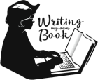
Toward the end of 2015 when I committed myself 100% to Writing My Own Book, I knew it was time to transform my entire brand. This was the result.
![]()
I had a general concept of what I wanted. The whole process of logo redesign went faster because I hired a contractor on Fiverr.com. While I had an Illustrator CC license, I was still learning how to use it. I asked him to use Illustrator to execute the logo’s details for me, using a photograph I had once used on my Writing as a Ghost website.
I added Website redesign.
My WritingasaGhost.com website already went through one redesign, since it’s inception in 2006. My husband was unemployed at the time. He took a class in HTML, and as a result, learned how to hand code a new site for me in 2010. I loved the site. However, I did get feedback, mostly from men, that the website was difficult to read.
In addition, I found content management was a major headache. So I finally settled on a compatible WordPress theme, and transferred all the content to a WordPress installation. I retained the dark theme for WritingasaGhost.com, cloning it for WritingMyOwnBook.com.
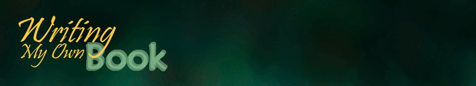
I never forgot the feedback about difficulty reading, however. So when I began thinking about rebranding my logo, I also considered rebranding my color identity.
It was easier than I’d expected. Turquoise is my favorite color, so was I excited to discover the ‘negative’ of my existing WritingasaGhost.com background produced the lighter background I have now.
At the same time, I totally replaced my website’s theme. I wanted more than a responsive design (which I already had). I wanted a website that had cleaner lines and felt more current.
I already had the website close to launch-ready, when a great sale on a script font came into my inbox. (I hadn’t discovered all the wonderful fonts at Google yet.)
I liked Lifehack because it balances two aspects of my personality. I’m one of those women who enjoys a certain level of femininity. Yet, I value being practical. Ruffles have their place, and so do jeans! I changed the font in my logo, and paid my theme developer to alter the code so Lifehack is one of the fonts on this website.

This is the current Writing My Own Book logo. I rejected the idea of using a tablet for two reasons.
- I don’t think I could write a book on a tablet, so using a laptop as the foundation for the logo concept seemed higher on the logic scale.
- It would be more difficult to convey the idea of ‘writing a book’ if it was beneath the hands. Such a picture would make me think of a blind person reading braille or a person with vision problems following the text with their finger.
Summary
Your logo is an investment that supports your marketing efforts. Enlist the aid of professionals, whether you choose someone who only specializes in logo design, or someone who specializes in branding overall. Your goal is a logo that harmonizes with who you are and the message you want to convey.

You must be logged in to post a comment.